Robbers Roost
Brand Strategy & Development
Problem
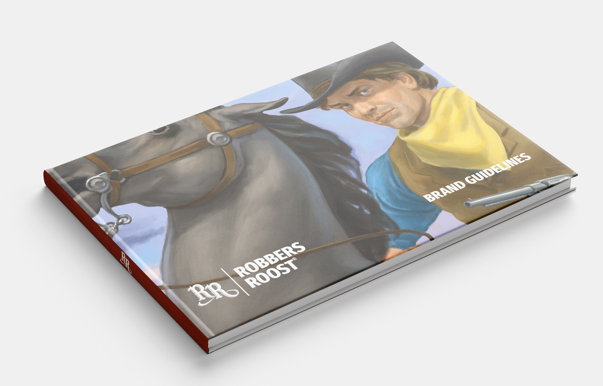
The best projects are the ones where you get to play. The fine folks at Robbers Roost came to us with the goal of expanding and rebranding their delightfully tasty whiskey. Their packaging was a little outdated, and the creative brief heavily featured 50’s pulp Western illustrations as the starting point.
Solution & Impact
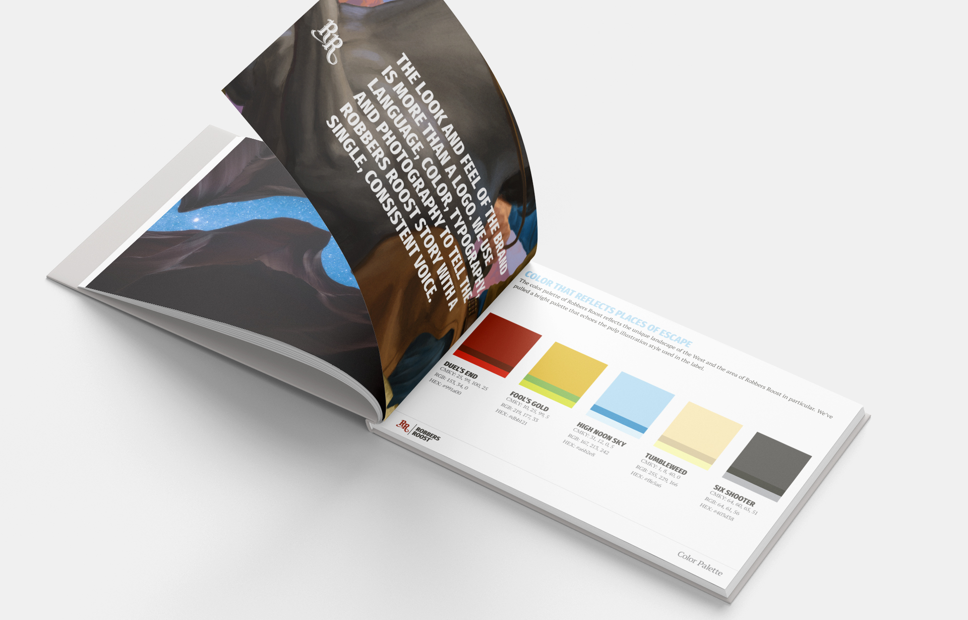
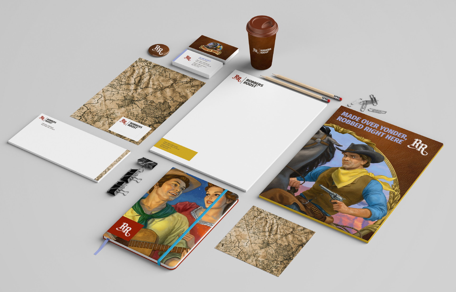
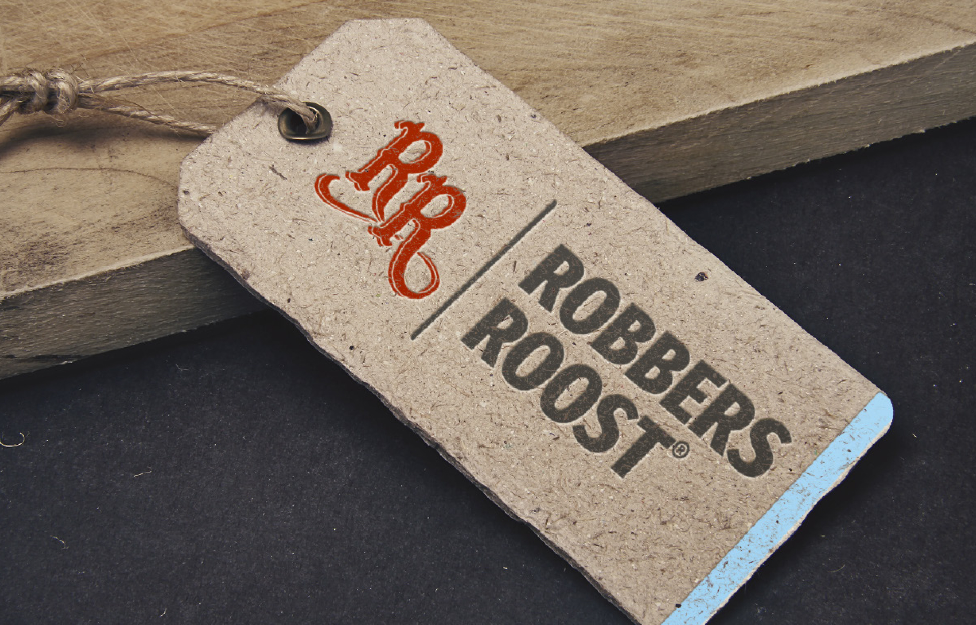
We ran with it. Found ways to integrate the illustration style into a unified brand that feels both playful, but also crisp enough to trust and open up to on a night around the campfire. Initial creative provided an opportunity to put the brand on full display. The flourish of the RR mark lends itself to brand on wooden packaging boxes, smashed letterpress treatment of bottle tags, and a healthy dose of messaging consistency drive home the importance of a late night escape to the roost to tell tall tales after a heist.
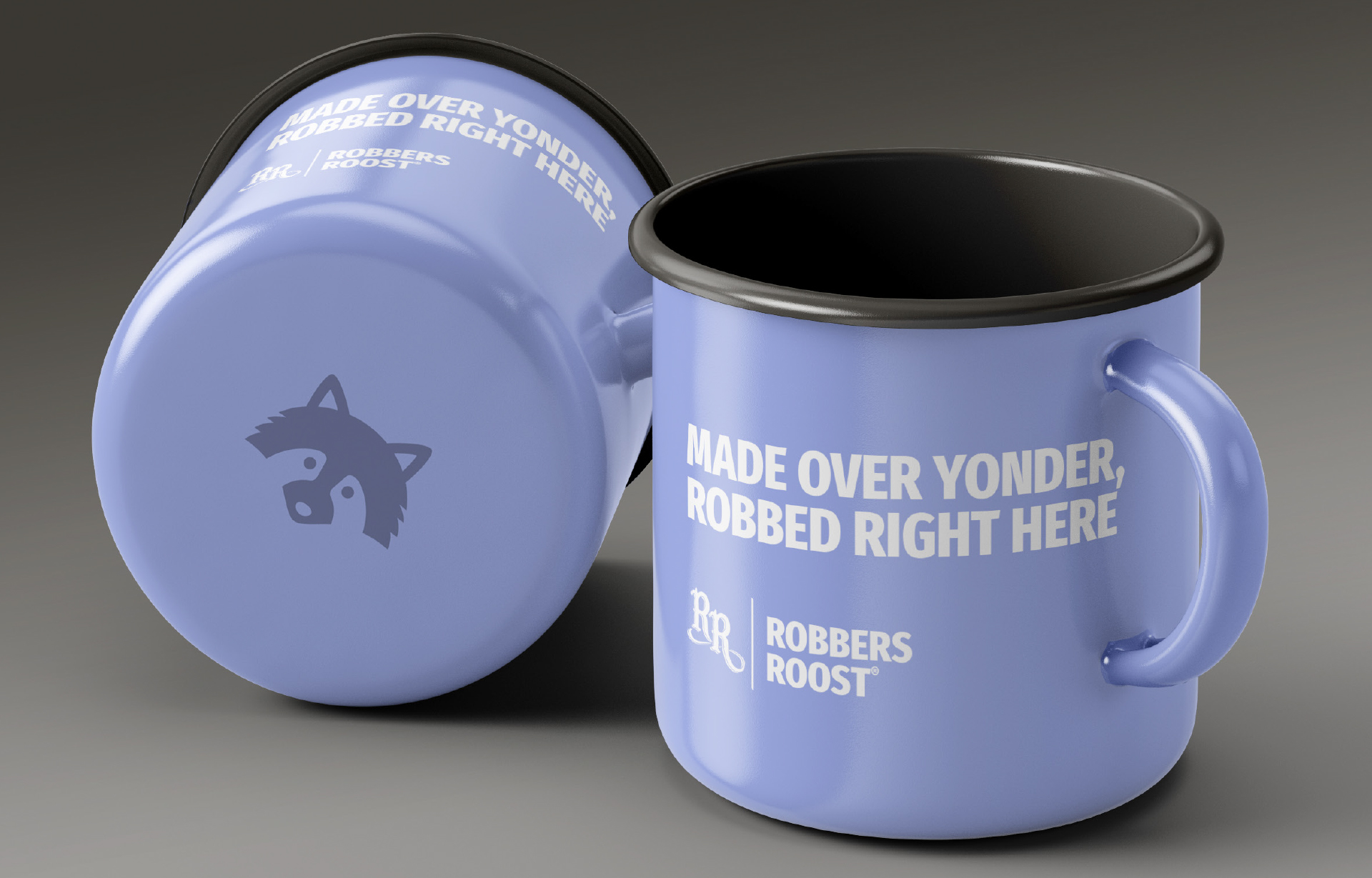
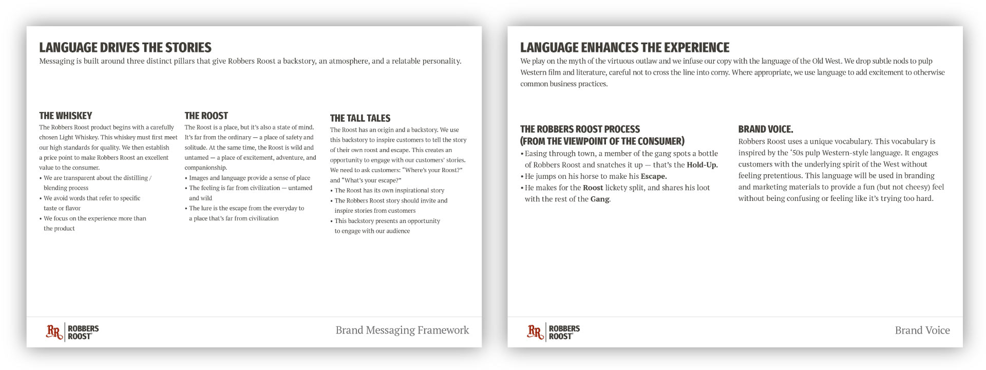
Hints of outlaw spirit, tall tales around campfire, all supporting the desire to get away from the everyday, find some adventure and maybe a little mischief.
