TruHearing Rounded
Custom Typography


Problem
TruHearing sought a way to strengthen its brand identity and create a consistent, memorable presence across all media and communications. While the custom typography in the logo was distinctive, the lack of a cohesive typeface limited its impact in broader applications. The challenge was to design a corporate typeface that encapsulated the approachable, trustworthy, and professional qualities of the brand, ensuring consistency and recognition in all touchpoints.
Solution & Impact
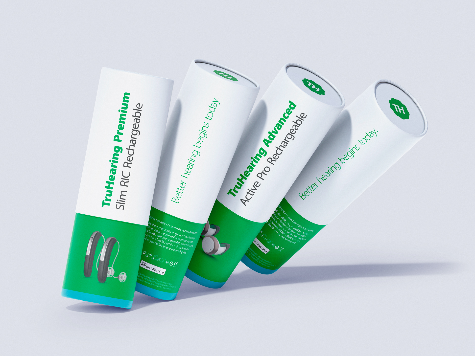
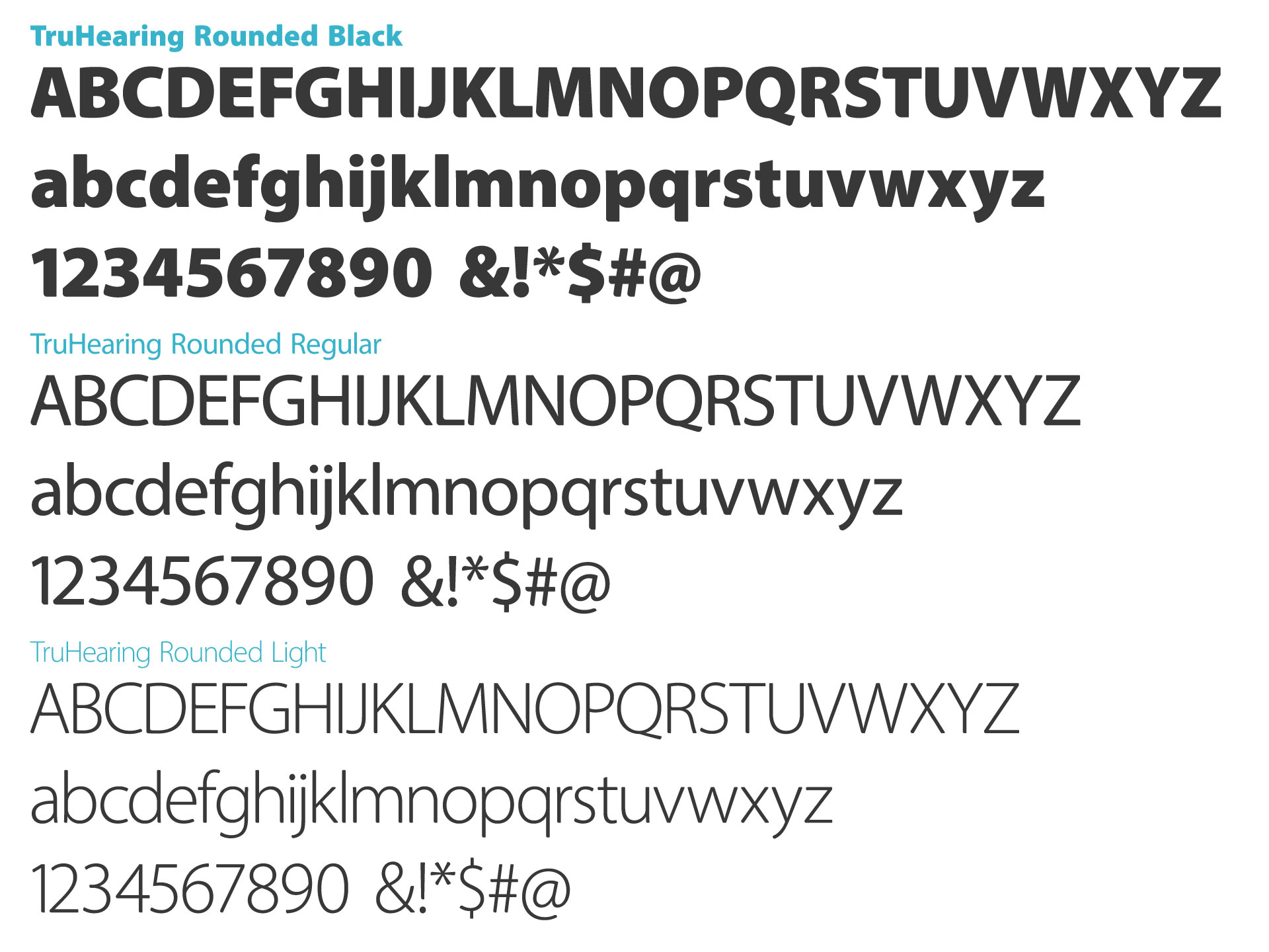
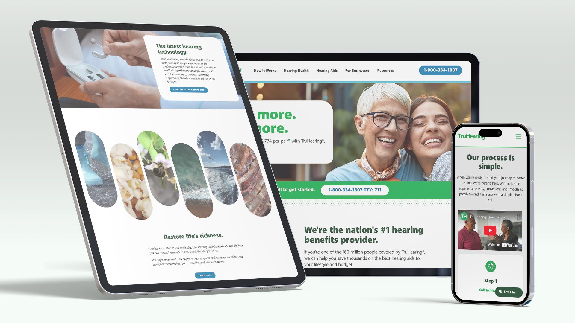
To address this challenge, we designed TruHearing Rounded, a bespoke typeface inspired by the logo’s subtle and friendly qualities. This typeface balances approachable, rounded elements with a clean, professional aesthetic, perfectly aligning with TruHearing’s brand values. By integrating the new typeface into all corporate communications, marketing materials, and digital platforms, we not only elevated the brand’s visual identity but also deepened its resonance with customers.
Additionally, the typeface was created with several light, regular, and black weights and corresponding italics. A full set of diacritic marks creates support for all languages that make use of the greek alphabet.

The result is a unified and recognizable brand visuals embedded into every single word.
